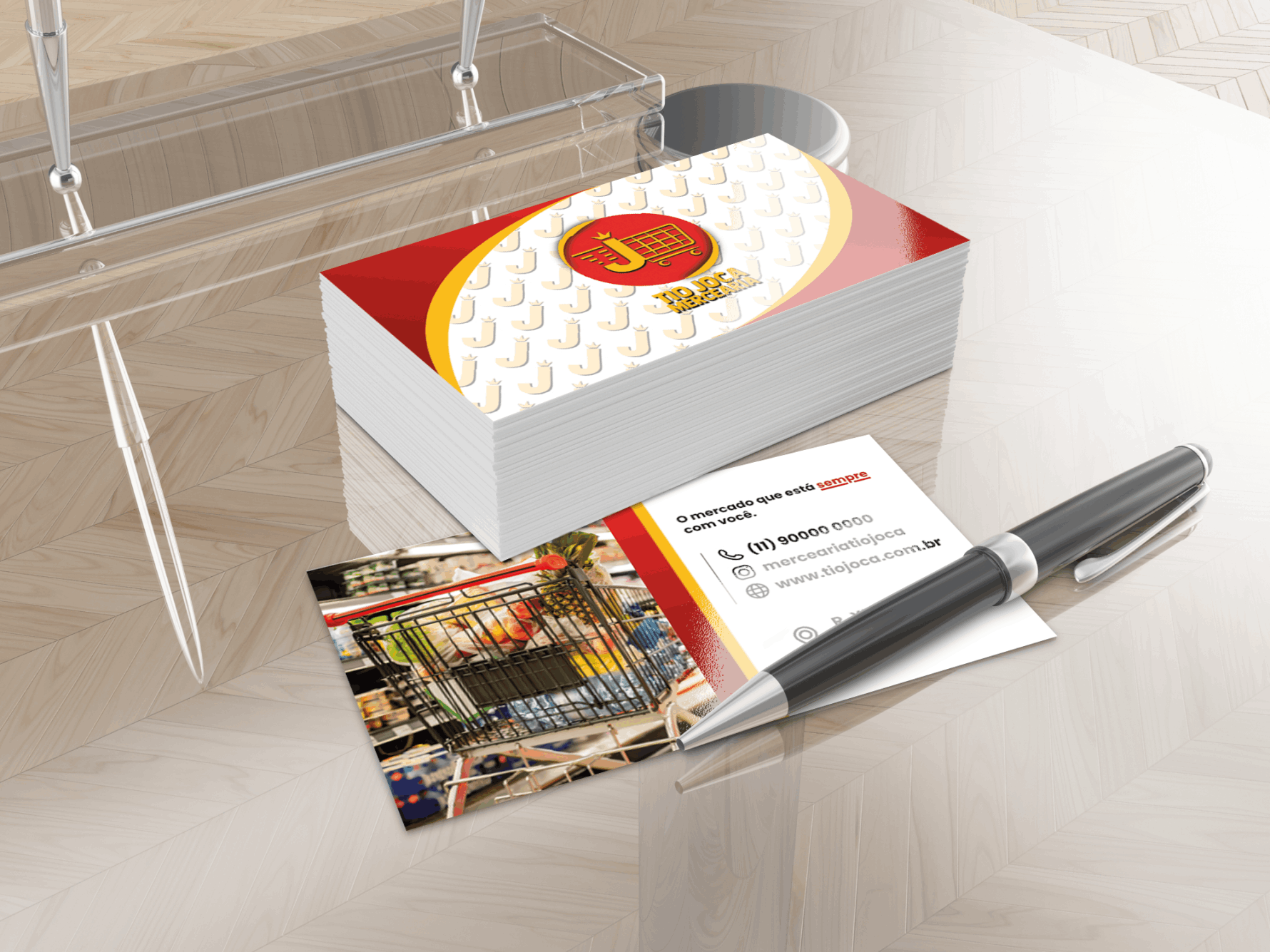
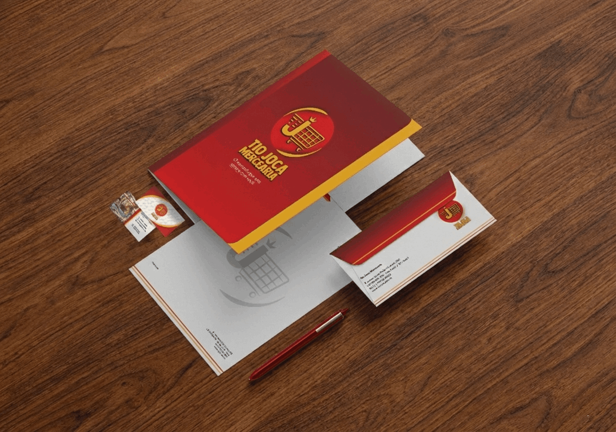
Business Card
MOCKUP
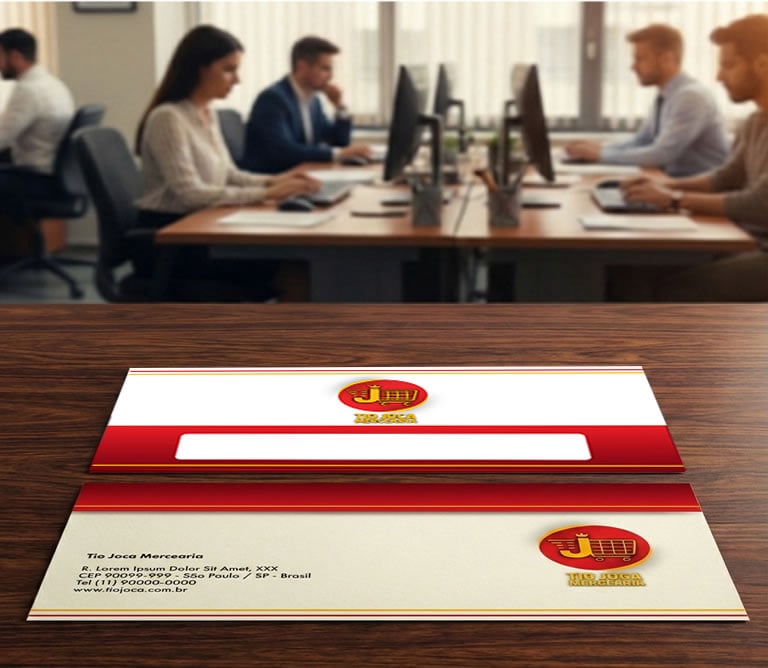
Office envelope
MOCKUP
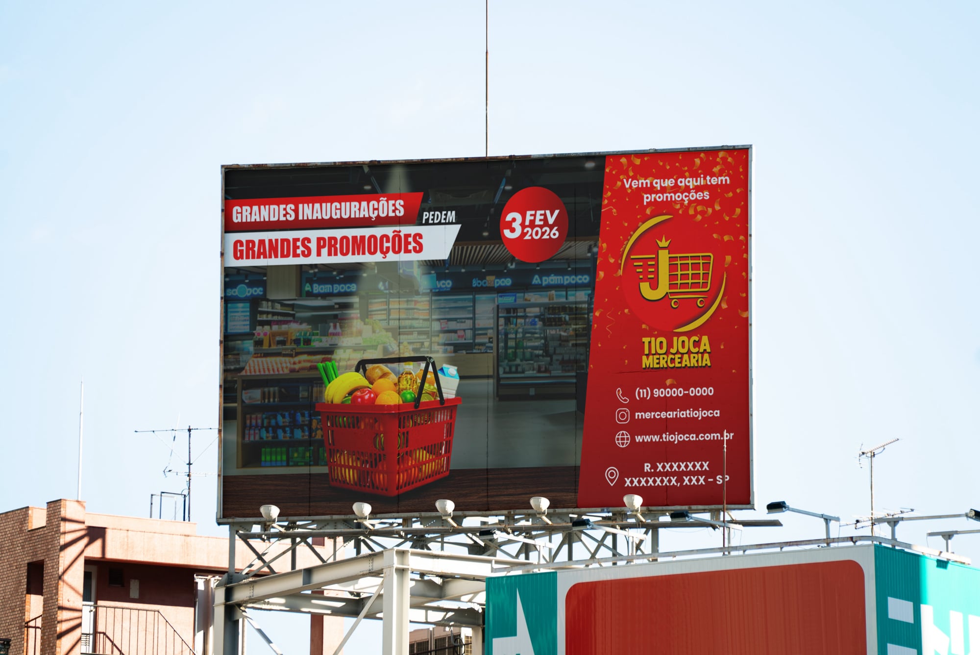
Outdoor 5m X 3m
MOCKUP
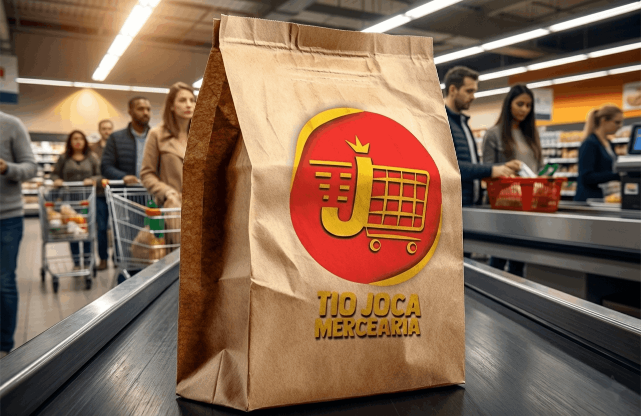
Eco-friendly Packaging
MOCKUP
Weekly Tabloid
MOCKUP
Printed
MOCKUP

The basis for creating other brand elements.
The chosen logo type (style) was a combination (text + symbols) due to the nature of the client's user.
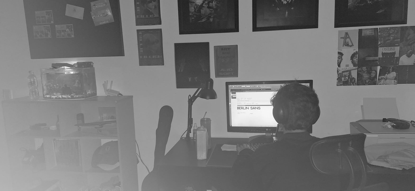
The font chosen for the grocery store logo is Bebas Neue Bold or a similar variation, such as Impact, with style modifications (yellow shadows and outline).
The typography is sans-serif.
The style is impactful, bold, and with all capital letters, designed to be easily read and visually strong.
The idea and reason for the choice was to use free or commercially available fonts that are easy to find, such as the Bebas family, given the nature of the client.
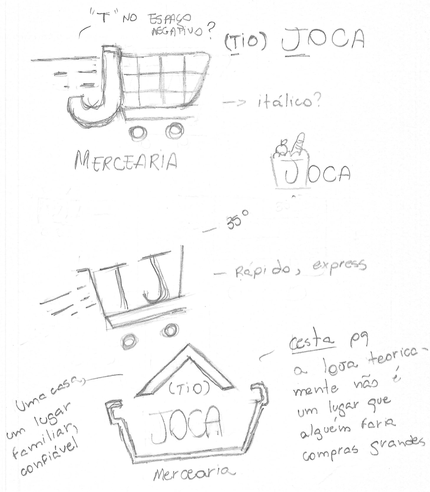
Sometimes it all starts analog; on a blank sheet of paper. That initial study, with trial and error, generates many drafts and provides the basis for the choice. And in this case, the first idea "won"...
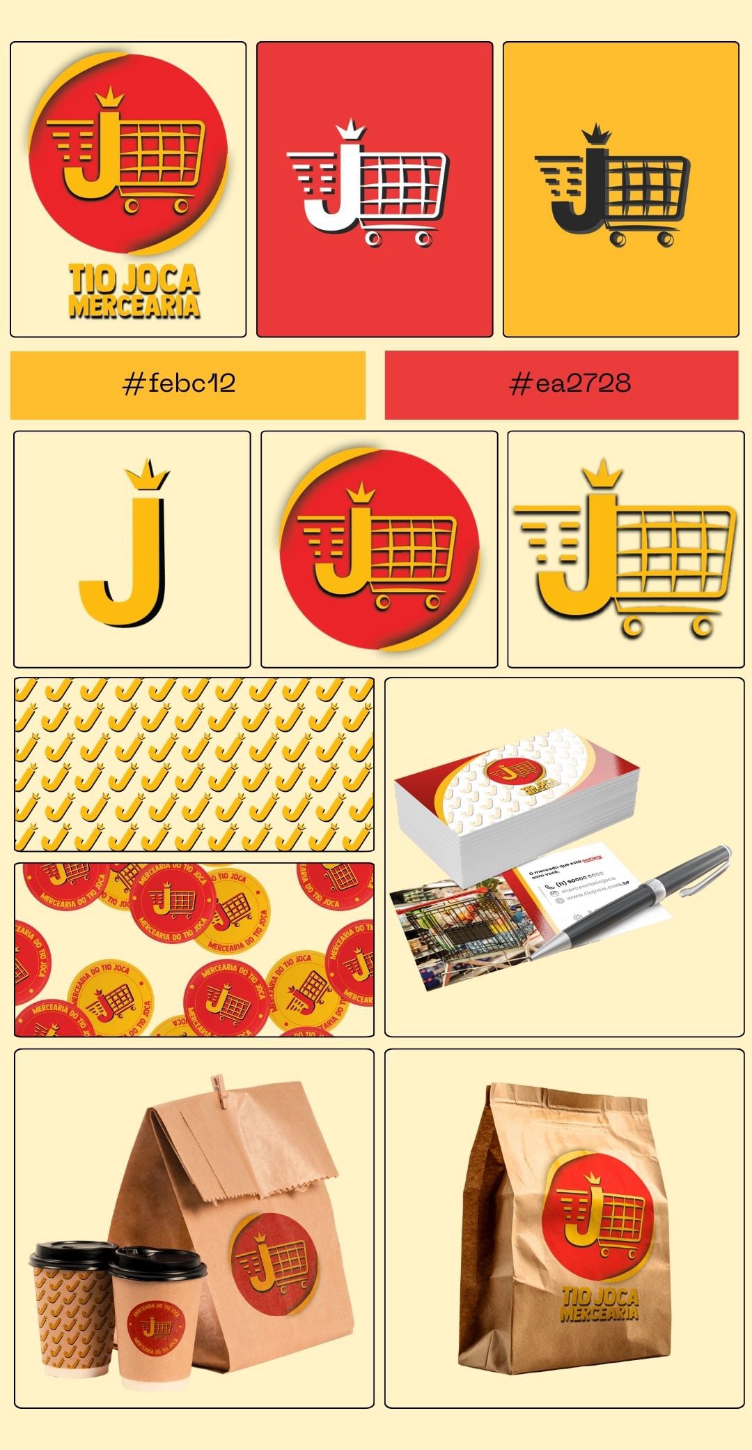
A summary of the brand's visual identity.
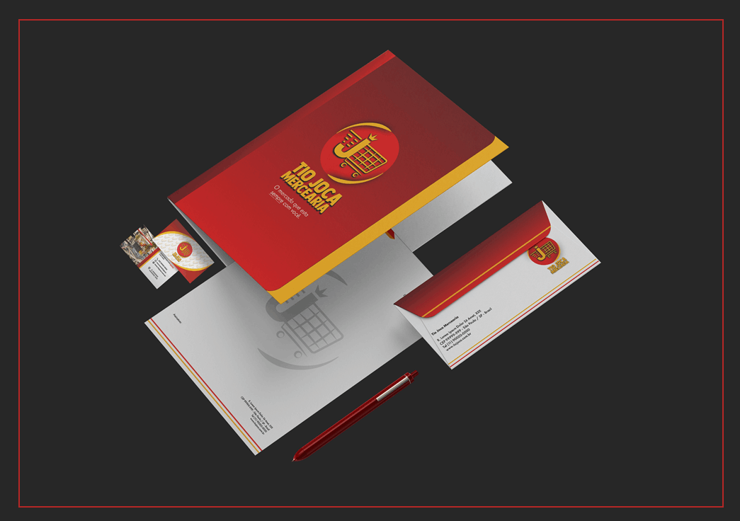
• Folder
• Letterhead
• Business envelope
• Business cards
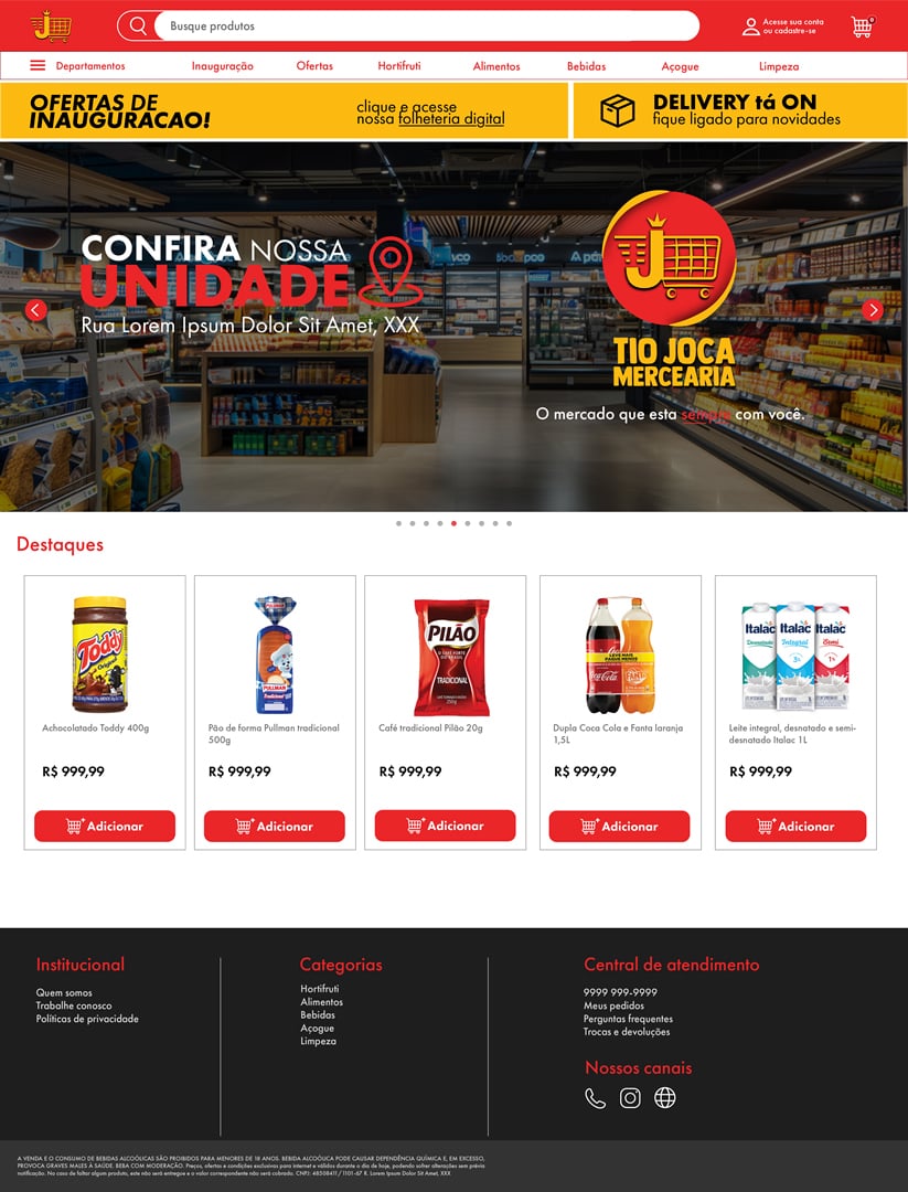
The website's homepage is already using the new visual identity.
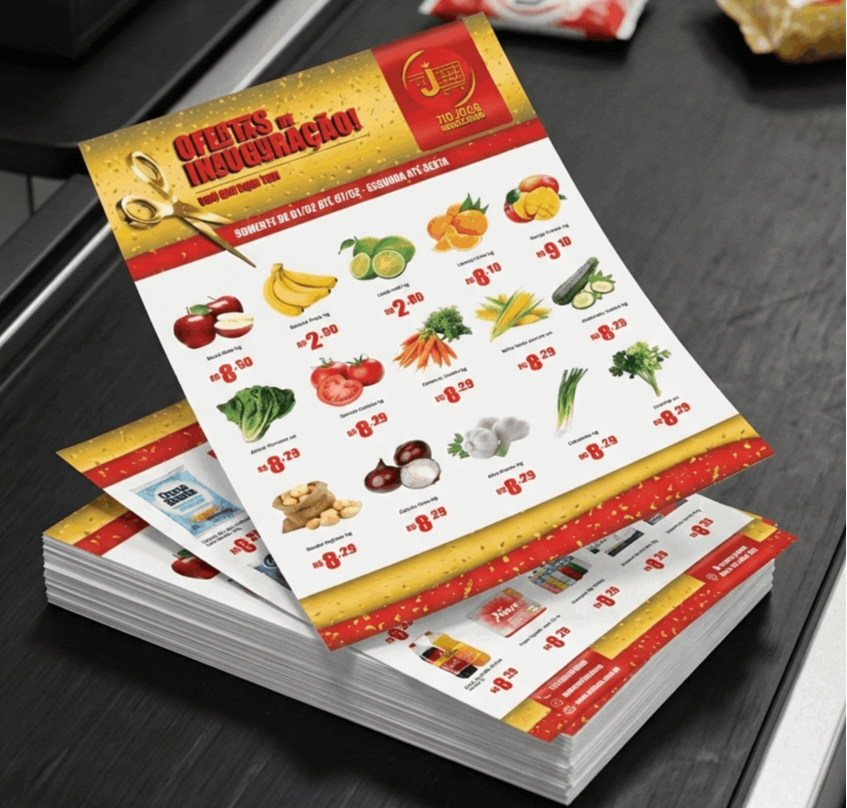
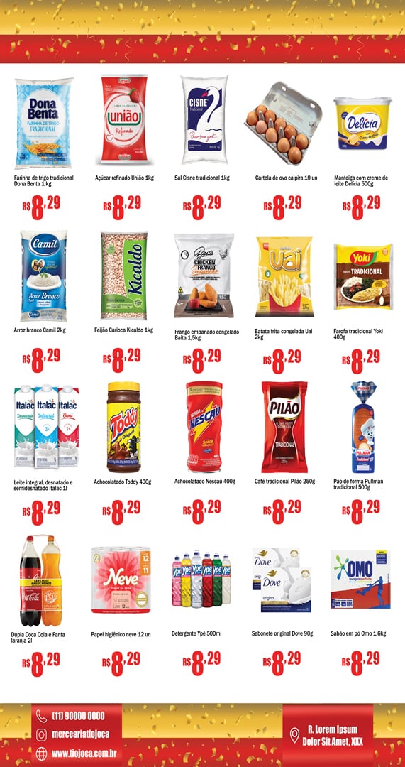
Weekly tabloid featuring special store opening offers at competitive prices.
FRENTE
VERSO
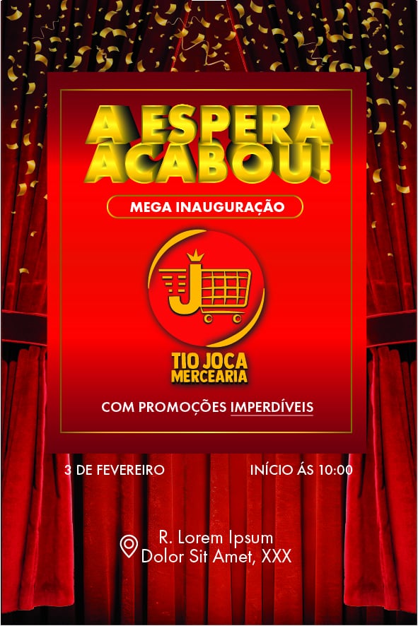
10cm X 15cm
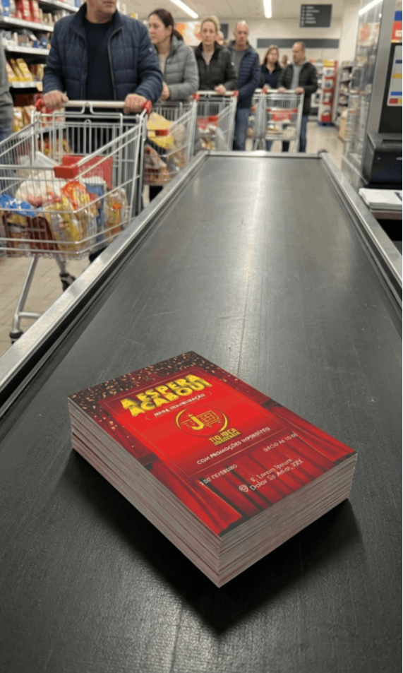
Mockup
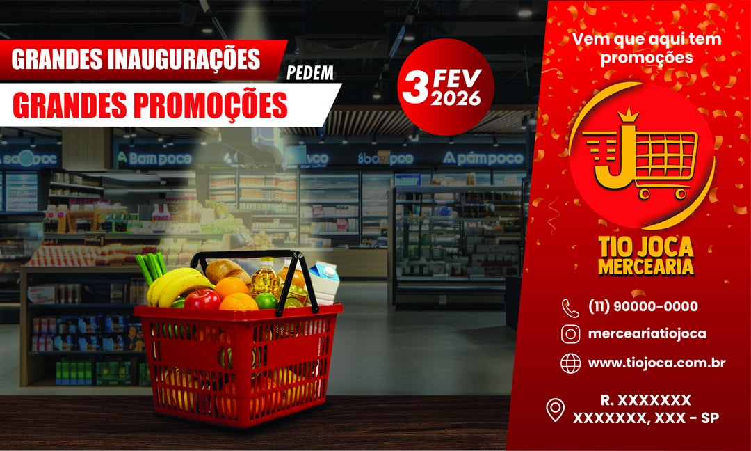
Width: 5 meters
Height: 3 meters
FIAT FIORINO
The customer will make quick deliveries within a 5-kilometer radius of the store. They will be using a white Fiat Fiorino van. This is the suggested vehicle wrap.
Wrapping is a simple and effective marketing strategy. While serving the store's purposes, it also promotes the business automatically.
Although the initial draft was more than satisfactory, the final result will only be edited after rearranging and adapting the elements.
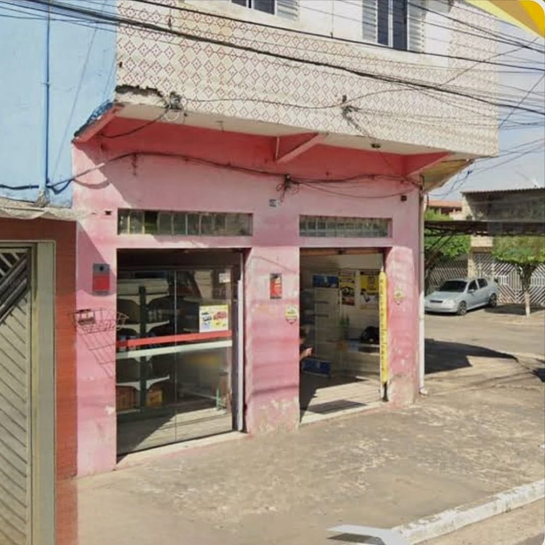
The client rented the entire building.
Including the mezzanine, to be used as an office and storage area. The interior layout will be designed by a professional specializing in merchandising.
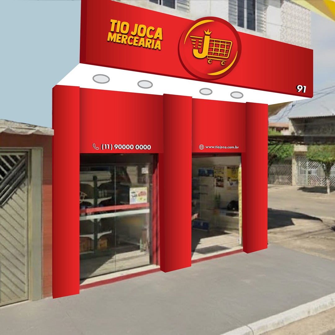
The suggested design uses red ACM panels and yellow aluminum lettering matching the logo font. The logo element will be an adhesive applied to an ACM panel and placed over the main ACM facade, creating volume through the overlap. Other information such as store number, phone number, and website address will also be in white lettering, as shown in the illustration. For the mezzanine, a simple paint job is suggested to reduce and control costs.
Business Card
MOCKUP
Office envelope
MOCKUP
Outdoor 5m X 3m
MOCKUP
Eco-friendly Packaging
MOCKUP
Weekly Tabloid
MOCKUP
Printed
MOCKUP